Closed
Bug 424899
Opened 17 years ago
Closed 13 years ago
Integrated back/forward history drop down should appear under the keyhole
Categories
(Firefox :: Theme, defect)
Tracking
()
RESOLVED
WONTFIX
People
(Reporter: faaborg, Unassigned)
References
Details
Currently the integrated back/forward drop down hangs to the right of the drop marker. Ideally the left edge of this drop down should line up with the far left side of the keyhole.
Flags: blocking-firefox3?
Comment 1•17 years ago
|
||
Really? I can see that logic being used on compound buttons like Organize and Views, and I know it's what IE and Windows Explorer do, but that's always seemed pretty awkward to me.
Not a blocker, but would be interested for a quick rationale as to why we think this is a good decision. Is it just parity with Explorer, or do you think there's a strong usability basis for doing this?
Flags: blocking-firefox3? → blocking-firefox3-
| Reporter | ||
Comment 2•17 years ago
|
||
I believe a better natural mapping will help to conceptually reinforce that this is a unified back/forward menu.
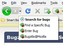
In virtually ALL applications the drop down menu fits to the left side of the whole button, but not only to the left side of the drop down arrow. Just look at Fx2:
http://www.abload.de/img/dropdownxjo.png -- the menu fits to the left edge of the icon.
Fx3 should behave like Fx2 and all the other programs.
"but that's always seemed pretty awkward to me."
why? Even the toolbar buttons with a drop down arrow (e.g. adblock plus toolbar button) have a drop down menu which fits to the left edge of the icon (in both Fx2 and Fx3 theme). Allready for just that reason of consistency the back/forward history drop down should look like others.
Furthermore, just compare:
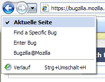
http://www.abload.de/img/fxoato.png
http://www.abload.de/img/ie4sjg.png
I think most people would like the left-justified IE menu more.
Comment 4•17 years ago
|
||
One more thing would be the usability. At the moment the user has to move the mouse to the bottom and to the right to definitely select an entry. If the history menu would be aligned to the left of the keyhole, you cannot accidentally click outside the menu.
Comment 5•17 years ago
|
||
Looks like this would be quite a simple fix (try adding this to userChrome.css):
toolbar[mode="icons"][iconsize="large"] #back-forward-dropmarker > menupopup {
-moz-margin-start: -62px;
}
toolbar[mode="icons"][iconsize="small"] #back-forward-dropmarker > menupopup {
-moz-margin-start: -48px;
}
Comment 7•17 years ago
|
||
(In reply to comment #5)
Actually, that would only fix the keyhole on Windows. This suggestions won't work when we don't control the exact width of the buttons (e.g. when there's text), though. This will thus remain a userChrome.css hack for Firefox 3.
Comment 8•17 years ago
|
||
(In reply to comment #7)
> (In reply to comment #5)
> Actually, that would only fix the keyhole on Windows. This suggestions won't
> work when we don't control the exact width of the buttons (e.g. when there's
> text), though. This will thus remain a userChrome.css hack for Firefox 3.
Couldn't we obtain the width of the buttons at runtime and apply a CSS rule dynamically?
Comment 9•17 years ago
|
||
Using FF beta 3 on Mac OSX. I noticed this today when I realized that I was using the History top-level menu much more than I had under FF2.
"Why is this?" I asked myself. "Wouldn't it be convenient if there was some toolbar-level drop down menu with, say, the last 5-10 visited sites?"
"Wait..." the realization dawned slowly ... "wasn't there one of those in FF2? I think I just had to click and hold the back button." Clicked. Held. Nothing.
Huh. Where did my history drop-down go? Wait, what's this little button?
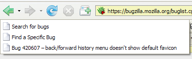
Aha. I found the history drop-down, located in exactly the worst possible place to locate it, after nearly two months of using FF3. This is a feature I used pretty regularly in FF2.
This is absurd. If you can't think of a better place to put it, it should revert back to click-and-hold on the back button which, while not as instantaneous as I'd like, is at least even vaguely intuitive.
| Reporter | ||
Comment 10•16 years ago
|
||
Changed my mind, resolving as invalid.
Status: NEW → RESOLVED
Closed: 16 years ago
Resolution: --- → INVALID
Comment 11•16 years ago
|
||
Please reopen this bug. there are many reasons for fixing this bug. see comment #3 and #4.
| Reporter | ||
Comment 12•16 years ago
|
||
This placement is important if users start to rely on click and hold.
Status: RESOLVED → REOPENED
Resolution: INVALID → ---
Comment 13•14 years ago
|
||
As the drop markers have been removed in firefox 4 should this be resolved either wontfix or invalid?
Whiteboard: [wontfix?]
Comment 14•13 years ago
|
||
As comment 13 pointed out, this UI is no longer present in trunk and we don't have plans to change this in older versions.
Status: REOPENED → RESOLVED
Closed: 16 years ago → 13 years ago
Resolution: --- → WONTFIX
Version: Trunk → 3.6 Branch
Updated•13 years ago
|
Whiteboard: [wontfix?]
You need to log in
before you can comment on or make changes to this bug.
Description
•